5 min read
A Typesetting and Design Case Study
Written by:
Troubador Publishing
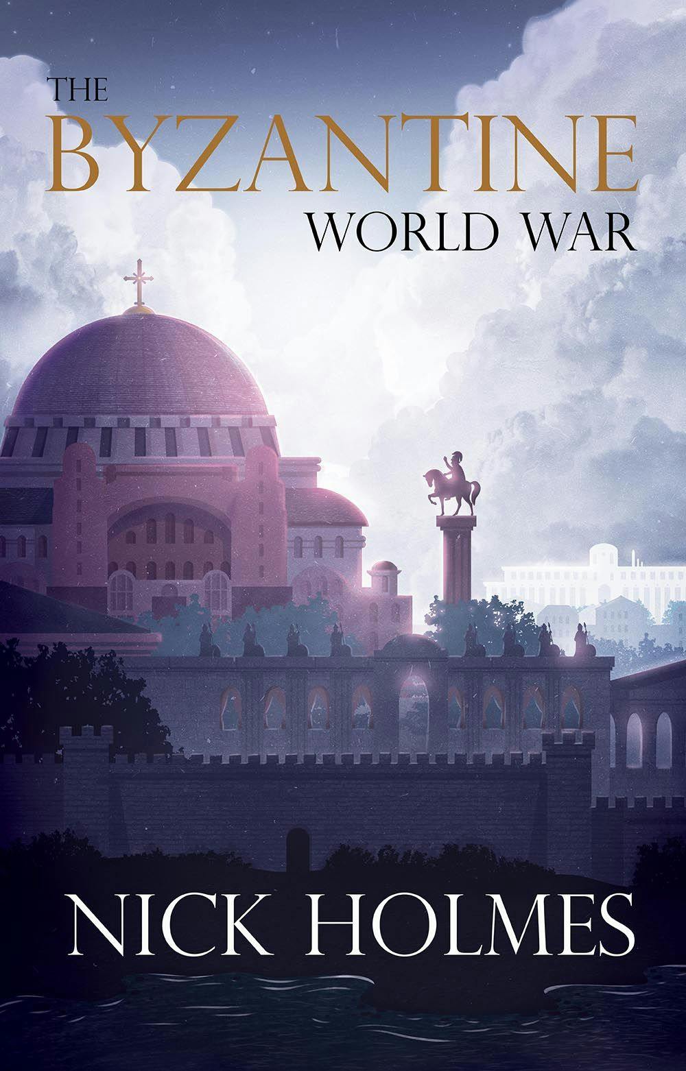
So far on this blog we’ve talked a lot about different elements of production, and looked at typesetting and how to import the manuscript, style choices, indexing etc. But what’s it like to actually apply these to a specific book? For this blog post, we delve into Nick Holmes’ The Byzantine World War, an extensively researched account of the fall of Byzantium and the First Crusade. The typeset we did here at Matador involved many different elements, each posing its own challenges. Here we take you step by step through the book’s interior production process, to give you an idea of how we make typesetting choices.
Before we do anything
As is common with non-fiction titles, Nick’s manuscript featured both footnotes and endnotes. It is crucial when we are importing a manuscript, from an author’s word-processed original document to our typesetting software, that features like this are correctly carried across. Footnotes and endnotes are important and if they are lost in the importing process then it makes adding them in manually a very painstaking process. Once we had ensured that all footnotes and endnotes were included in the transfer, we knew the text was in good shape for typesetting.
Now for the creative part…
So what will the book’s interior actually look like? For Nick’s genre, subtle chapter headings that leave plenty of room for the page to breathe are increasingly on trend. We chose the font Cormorant for the header and the drop cap as its serifs are particularly sharp and clear; we didn’t want the drop cap to steal too much attention on the page, so we limited it in size. We then applied the font Adobe Jenson Pro for the main body text; its old-style, elongated serifs suited the subject matter, leading Nick to comment: “The team’s choice of fonts and page design showed a careful appreciation for the subject matter.”
Let the typeset commence!
Once the initial style was established and approved by Nick, we moved on to typesetting the book in its entirety. We ironed out paragraph spacing, set subheadings consistently and eliminated those troublesome orphans and widows (lines/words that run over or hang back at page and paragraph ends). Nick had lovely illustrated maps in his original document, which were clearly labelled with their location, aiding us when it came to setting them in the correct places throughout the text. The book was also divided into three parts, giving us another chance for us to get creative. There are typesetting conventions around using part pages (the pages that divide sections) and as Nick said: “There were lots of nice touches that I would never have thought of, like the borders around the part heading pages… perfectly in tune with the theme and feel of the book.” Being non-fiction, there were lots of elements which needed careful consideration in design terms: timelines, lists of key people, bibliographies, a glossary and an index – all of which our design team had great fun styling and which Nick said, “all fitted together perfectly to produce a highly professional book.”
The prelims
Once the main text had been set, it was time to do the preliminary matter (first pages of the book). With title pages – the very first pages of the book – we are always looking to replicate themes from the cover or from the interior; with this in mind, we decided to adopt the framed border that Nick loved from the part pages. The most referenced preliminary page is the table of contents, which is especially important to present neatly and logically. It may sound obvious, but the last a thing reader wants is something cramped or unclear. For instance, having a distinction in type size and style between part and chapter headings removes any doubt about which is which.
The plate section
Nick opted for an 8-page colour plate section to showcase his photographs of the Hagia Sophia and other key settings of the book. Plate sections are a cost-effective way to include colour photos because only a section is printed in colour rather than the whole book. The glossier, thicker paper also gives the images that added quality. As Nick’s images were high resolution too (over 300dpi), we were able to bleed certain landscape images off the edge of the page, maximising their size without the risk of blur. This really helps to enhance their impact and make use of the whole space available – and images bleeding to page edges give a more modern feel to plate sections.
Making amends
Once we have a finished typeset and the layout is complete, it’s time to give the text another read. Nick opted for our proofreading service, whereby a professional proofreader gives the typeset proof we have produced once over, looking for any final layout or punctuation errors. Nick then had the chance to mark up any changes he would like to make to the text. When both the proofreader’s and Nick’s changes have been marked, the proof is returned to us as a big stack of paper. Our team then go through page by page, corresponding with the proof on our screen and make any corrections to our typesetting file. Some rogue footnote numbers that hadn’t automatically been set as ‘superscript’ were picked up but otherwise, this process moved very smoothly. One of the final changes to the text was to add the index. Usually sent to us as a Word document, the index should only be completed once the majority of amendments have been made to the typeset file and we can be confident that no text will move from the page it is currently on. If the index had been done any earlier, the layout could have been altered slightly, even by one or two lines, subsequently changing the index reference. Once the full cover was approved, the book was given a final quality assurance check by the senior production team here and it’s off to the printers! Nick’s book was a joy to put together and designed with plenty of features to interest the reader, and the typesetter, in this fascinating insight into the Crusades and Byzantium.
The Byzantine World War is available to buy from the Troubador bookshop.

Alex Thompson
Rosemary Griggs: Turning a Passion into a Profession

Alex Thompson
D.S. Getson: How Tragic Family History Inspired my Historical Fiction
Alex Thompson
Steve Hill: Inspiring the Next Generation
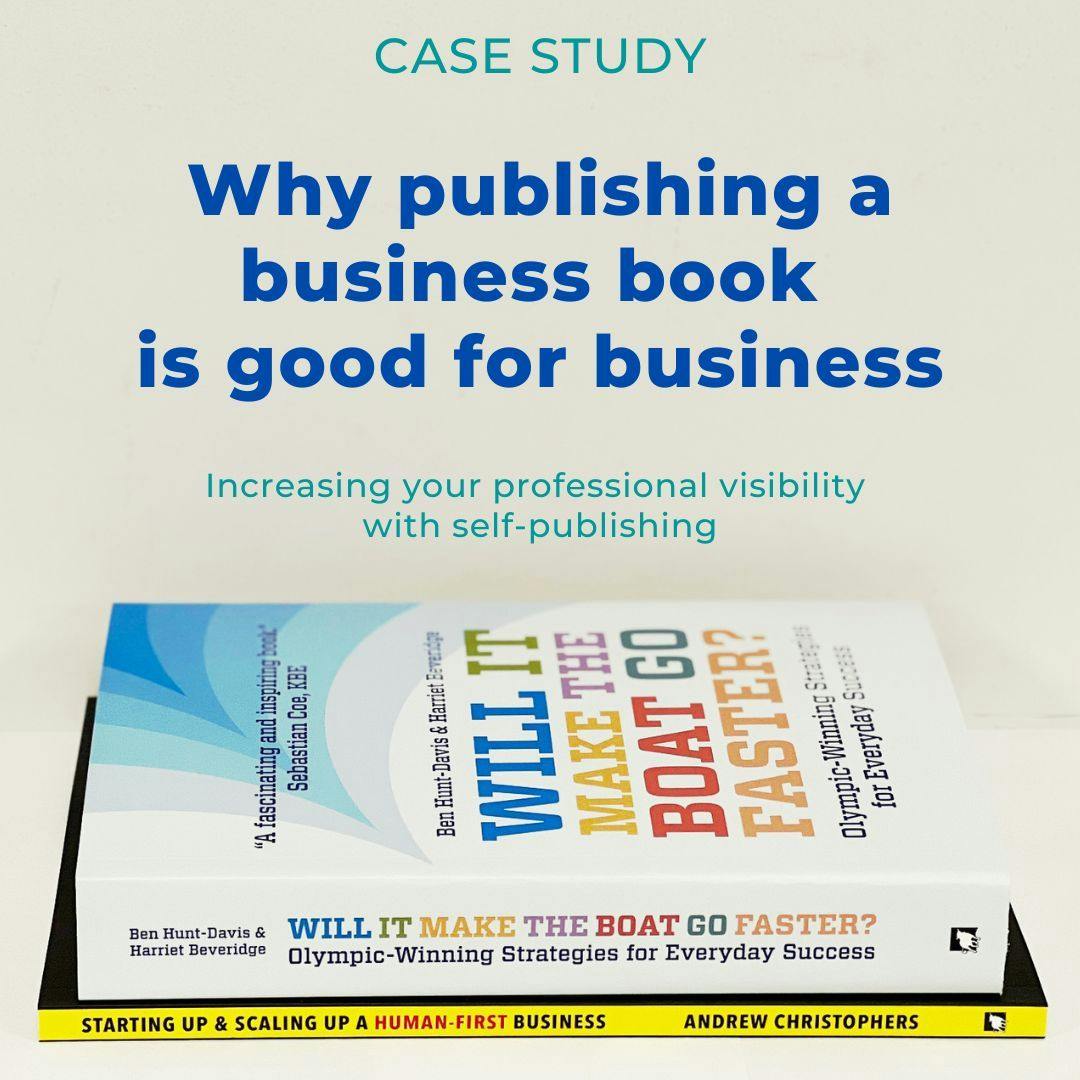
Why publishing a business book is good for business

The Art of Storytelling: Uncovering the Inspiration for Writing Children's Books
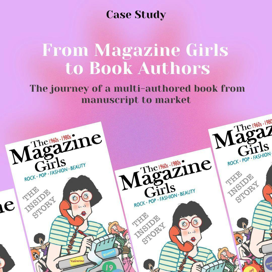
From The Magazine Girls to book authors: our journey to publication
Troubador Author Interviews - Jude Hayland
The Pursuit of Perfection
Self-Publishing with Troubador - An Author's Experience by Andrew Mullaney