22nd November, 2023
5 min read
Typesetting: Book Formatting Tips for Self-Published Authors
Written by:
Jeremy Thompson
Typesetting and page layout are crucial aspects of self-publishing that can significantly impact the quality and readability of your book. It’s where the magic of words meets the art of presentation… as the author you provide the words, but who provides the all-important presentation?
You might think, "What's the big deal? It's just about fonts and margins, right?" Oh, but it's so much more than that!
Imagine this: you pick up a book, in a bookshop and the fonts are tiny, the lines of text cramped and the margins non-existent. Puts you off buying it, yes? Why should a reader struggle with a poorly designed book when there are so many other beautiful books out there to read? It’s too late for that book you’ve just picked up (and now just put back down again!), but not if you’re still at the start of your self-publishing journey. This is where typesetting swoops in as the unsung hero, making sure your book’s reading experience will both look professional and be enjoyable.
Let's start with margins. They’re like the breathing space for your words. A generous margin creates a comfortable buffer zone, preventing your eyes from feeling overwhelmed. It's the white space that allows your text to shine, making the whole reading process a delight rather than a slog.
Fonts? They’re the personalities of your words. Picture this: a thriller novel written in Comic Sans. Not very thrilling, right? Choosing the right font sets the mood, enhances readability, and adds that extra oomph to your content. Serif, sans-serif, elegant, quirky – the options are endless, each one speaking a different language to your reader.
Accessibility is key. Typesetting isn’t just about aesthetics; it’s about inclusivity too. Think about readers with visual impairments or dyslexia. Properly chosen fonts, well-adjusted line spacing, and adequate contrast make the reading experience a breeze for everyone. It's like rolling out a welcome mat for every reader, ensuring they feel right at home in your book’s world.
Let's not forget the unsung hero of non-fiction: the index. Ever tried finding a specific nugget of information in a book without an index? It's like searching for a needle in a haystack while blindfolded. A well-crafted index is a roadmap, guiding readers to exactly what they need, saving time and frustration.
Now, style – this is where the details shine. Consistency in formatting, headers, footers, and overall layout elevates the reading experience. It’s the glue that holds everything together, ensuring your book looks polished and professional from cover to cover.
The real magic happens when all these elements work in harmony. It's not just about making the words look pretty; it’s about creating an immersive experience that captivates readers. Good typesetting is like a conductor orchestrating a symphony – you might not notice it directly, but it shapes the entire reading journey.
So, next time you crack open a book and get lost in its pages, take a moment to appreciate the artistry of typesetting. It’s the invisible hand that turns a collection of words into a captivating adventure, making your reading escapades all the more enjoyable.

Key pointers
Here are some key things a self-publishing author should know about typesetting and page layout to ensure a high-quality book:
- Professional Typesetting Software: Invest in professional typesetting software, such as Adobe InDesign, to format your book. Avoid using word processors like Microsoft Word for complex book layouts, as they are not designed for this purpose.
- Page Size and Margins: Choose an appropriate page size for your book. Set consistent and appropriate margins for the top, bottom, inside (gutter), and outside edges of the pages to ensure readability and aesthetic appeal.
- Font Selection: Choose legible and book-appropriate fonts for the body text and headings. Commonly used fonts for body text include Times New Roman, Garamond or Minion. Ensure the font size and line spacing (leading) are suitable for readability.
- Hyphenation and Justification: Set proper hyphenation and justification settings to avoid large gaps between words and awkward line breaks. A professional look and feel are achieved by minimizing widows (single words at the end of a paragraph) and orphans (single lines at the beginning of a new page or column).
- Consistent Styling: Maintain consistent formatting throughout the book. Use the same fonts, font sizes, and spacing for headings, subheadings, body text, and other elements. Establish a style guide for your book and adhere to it.
- Page Numbers: Add page numbers to your book, typically in the footer or header of each page. Ensure they are consistent and follow the proper sequence (e.g., Roman numerals for the front matter and Arabic numerals for the main text).
- Chapter Openings: Design visually appealing chapter openings with drop caps, decorative elements, or a specific style that distinguishes them from the rest of the text.
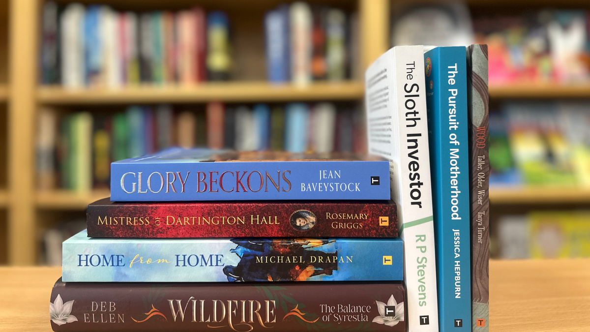
- Images and Graphics: If your book contains images or graphics, ensure they are high-resolution and properly placed within the text. Pay attention to the placement and captioning of figures.
- Paragraph and Line Spacing, Widow and Orphan Control: Adjust line spacing, also known as leading, to make the text comfortable to read. Adequate paragraph spacing is essential for readability and aesthetics. Use software settings to control widows and orphans, ensuring that paragraphs don't start or end with a single line at the top or bottom of a page.
- Running Headers and Footers: Add running headers (often chapter titles) and footers (often book titles or author names) to provide a professional look to your book.
- Print and eBook Formatting: Keep in mind that formatting for print and eBooks can be different. Ebooks may require special formatting for reflowable text and might not support all the design elements used in print books.
- Proofreading and Testing: After formatting, thoroughly proofread your book to catch any formatting errors, typographical mistakes, or layout issues. Test your book on various devices and formats (e.g., Kindle, ePub, PDF) to ensure it looks good and functions correctly.
Professional Help
Ok, so the above looks daunting doesn’t it? Most authors we find don’t want to learn how to become a cross between a designer and a technical wizard on typesetting software, preferring instead to pass this to a professional. A few hundred pounds invested in a typesetter will make the difference between a valiant effort and a shining example. At Troubador our inhouse production controllers design and typeset books day in day out, producing beautiful text and easy-to-read titles,
Remember that a well-designed book enhances the reader's experience and can make your work more appealing and credible. A polished and professional appearance can set your self-published book apart from the competition.

About the Author
Jeremy Thompson
Managing Director
Jeremy has over 35 years' of experience publishing, having worked for Elsevier, Wiley, CUP and many other companies. He founded Troubador in 1996, publishing book lists on various subjects, and launched the company's self-publishing imprint in 1999. Jeremy is a regular speaker on all aspects of author services and self-publishing at events as diverse as the Westminster Media Forum, The London Book Fair and the Self-Publishing Conference. Jeremy was elected as a Fellow of the Royal Society of Arts in 2019 in recognition of his work in independent publishing. In his spare time, he flies a light aeroplane, when the weather allows.