

24th January, 2024
4 min read
10 Tips for Using Images in Your Self-Published Book
Written by:
Jeremy Thompson
So you've been beavering away writing your masterpiece and now you’ve got a brilliant manuscript ready to hit the shelves. You want to include pictures because, as we all know, a picture is worth a thousand words. Now while writing has its own issues regarding the use of others’ text, the use of pictures brings a host of other things of which you need to be aware.
Correctly chosen images (drawings, illustrations, photographs… any sort of ‘graphical’ material) can elevate any book, and are an essential element in some types of book, but what things do you as a self-publisher need to consider when going about sourcing and choosing images?
Here are 10 tips to spice up your self-published book with eye-catching visuals while at the same time ensuring you don’t tread on any toes.
1. Size Matters: Before you go crazy with images, remember to get your size game on point. Oversized images might hog all the attention, while too-small pics can turn into pixelated nightmares. Aim for a resolution of at least 300 dots per inch (DPI) for crisp prints, and resize images accordingly. Pictures downloaded from the internet, while they might be in the public domain, are usually at a low resolution (typically 96dpi), so often don’t print very clearly. You may need to delve a little deeper to get a higher-resolution copy.
2. RGB vs. CMYK: Hold up! Don't just throw your vibrant RGB images into the mix without a second thought. Printing uses a different colour language – CMYK – to your computer screen – RGB. So convert your images to CMYK to avoid colour discrepancies between your digital or on-screen images and the printed versions. If you’re only printing in black, then your images must be in greyscale, not colour, as they will either not print at all, or will print very very dark. Use image manipulation software like Photoshop to convert from one colour format to another (there is plenty of free image editing software available for PCs and Macs too).
3. Caption This: A picture might be worth a thousand words, but a great caption can add even more flavour. Add brief, engaging captions to your images to provide context or evoke emotions. If you have obtained permission to reproduce an image, then include a copyright acknowledgement with your caption.
4. Placement Magic: Ever heard of the saying "right place, right time"? Well, the same goes for your book's images. Strategically place visuals where they complement the text, break up monotony, and enhance the reader's experience. A well-placed image can turn a page from blah blah to wham bam!

5. What's in a Good Image: Choose images that resonate with your story, enhance the narrative, and don't scream ‘stock photo’. Originality is key. Whether it's a bespoke illustration or a carefully chosen photograph, make sure it adds value to your masterpiece. Curate your images carefully so that including them will enhance your book, not just lengthen it!
6. Legal Eagles: No one wants a lawsuit knocking on their door. Ensure your images are legally sourced. Use platforms like Unsplash and Pexels, or purchase stock photos from reputable sites like Adobe Stock or iStockphoto.com. Respect copyright and your book will be all the better for it. It’s far better to exclude an image than include it without the correct copyright permission and risk the copyright holder claiming against you.
7. Late Section Visuals: Don't let your book fizzle out towards the end. Spice up those late sections with captivating visuals. Readers often remember the last things they see – make it memorable! Maybe a striking image that leaves them pondering or a graphic that summarizes your epic journey.
8. Cropping: Make sure that your image shows what it needs to show, not a lot of extraneous images. So that picture of Aunty Doris standing in a field? What’s important, Doris or the field? Crop your images down so you are showing the important stuff, not the ‘noise’ that surrounds it.
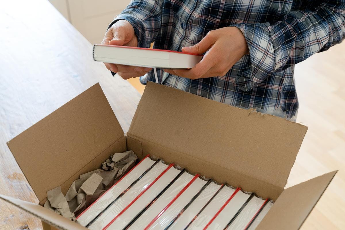
9. Inline images or plates: Consider whether you want to include your images printed on glossy paper, instead of on the same paper as the text of your book. This is usually known as a plate section, and can be in either colour or black only. A plate section printed on glossy paper will lift your images, but will likely add to the cost of printing, especially if you print them in colour (though this is probably the cheapest way of including great quality colour images in a book). And there's no reason why you can't do both, with black and white images included in your text and a plate section for those especially important photos.
10. Supplying Images – A Checklist: If you're working with a designer, formatting the book yourself or working with a self-publishing company like Troubador, make sure to provide images in high resolution. Communicate your vision clearly (where exactly are your images to be placed with respect to the text?), and double-check that the format (JPEG, PNG or TIFF) is suitable for the intended purpose. Smooth collaboration and clarity will make the page layout process go far more smoothly.
There you have it – 10 tips to make your self-published book pop with visuals. Now go forth and turn those pages into a visual feast! Your readers will thank you for the delightful journey you've crafted – words and images intertwined in perfect harmony. Happy self-publishing!

Most popular articles

Alex Thompson
The 6 Best Self-Publishing Companies in the UK 2024
Stephanie Carr
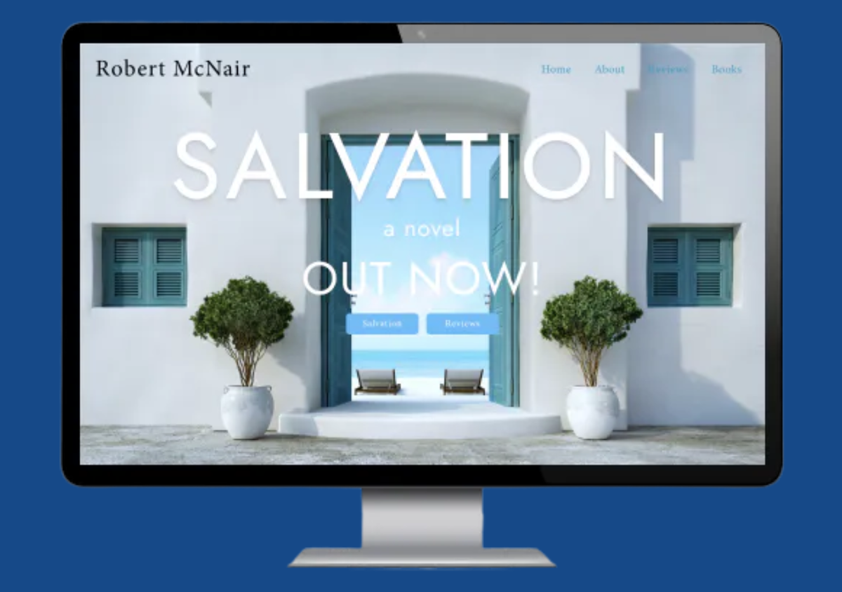
Unlocking the Power of Personal Branding: Why Author Websites Are Essential for Every Writer
Alex Thompson
What is Full-Service Self-Publishing & Why Should an Author Consider It?

Andrea Johnson
Kindle Direct Publishing (KDP) versus Troubador: What should an author know?

Jane Rowland